THE BRIEF
After successfully redesigning his personal website, TheSalonGuy decided to have me redesign his online store. In his shop he offers a range of organic, vegan, and cruelty free products, which reflect his passion for hair and skin health.
With hundreds of positive customer reviews, TheSalonGuy couldn’t understand why his sales did not reflect the good feedback. Plus, he has plans to integrate partnering brands into his shop and would like to increase his conversion to appear more credible to potential collaborators.
TheSalonGuy also expressed that fast page load time with a necessity (as it should be ;)).
My Approach
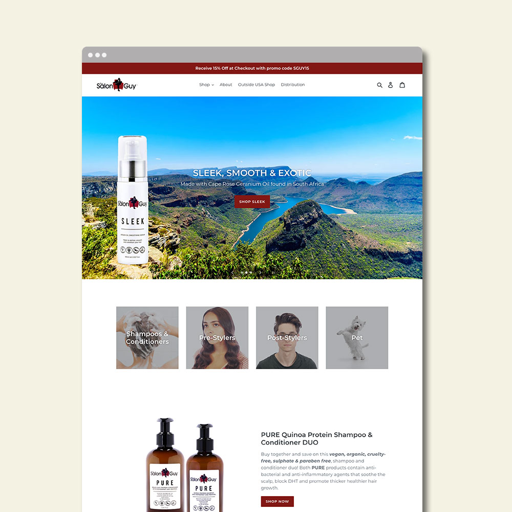
There were three things I instantly noticed were missing when I began auditing TheSalonGuys shop: 1) Appealing imagery 2) Call to actions 3) Model shots of his products in use.
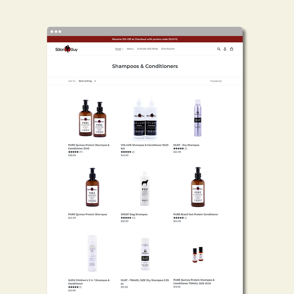
As a place to include all three, I added a main image slider to his home page. Here he could include eye catching photos, store highlights, and “shop now” links to encourage users to buy or browse around. To emphasize the quality of his products, I utilized many natural images and organic keywords that would make users aware of the many benefits of using his products. To add credibility to his product pages, I added model shots to show the product results. For fast page speed, I optimized all images used by making them the smallest file size possible without losing quality.


