THE BRIEF
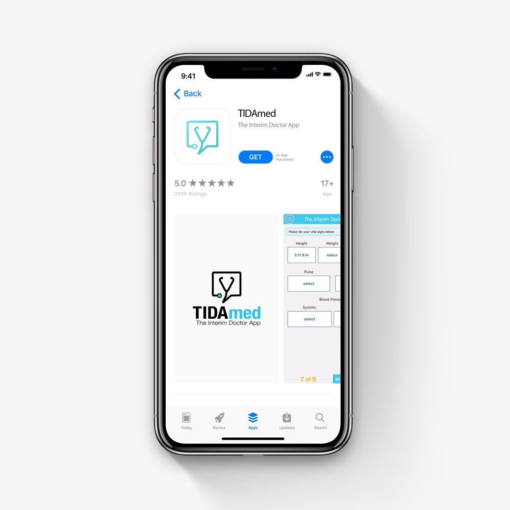
TIDAmed (The Interim Doctor App) is an app that offers minor ailment care in the palm of your hand. Just enter your information and symptoms, and a licensed medical professional will prescribe you treatment and sent the script to your pharmacy. With no insurance, video or phone call requirements, users can save time and money, with their discreet and accessible services.
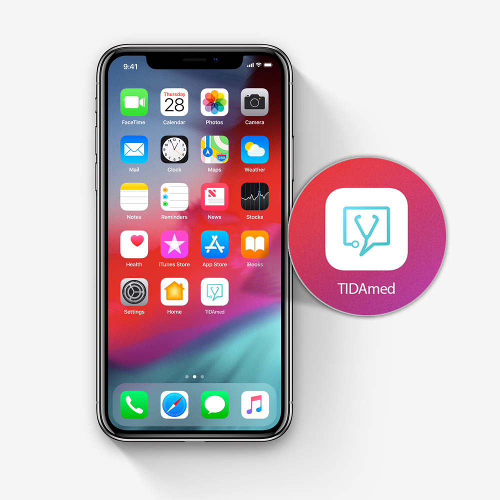
TIDAmed approached me with a need for a logo and app icon redesign. Their current logo was a group of animated characters that were difficult to see when sized down to the size of an app icon. They wanted a symbol that was sleek, easy to see, and represented a rising brand in the med-tech industry.
My Approach
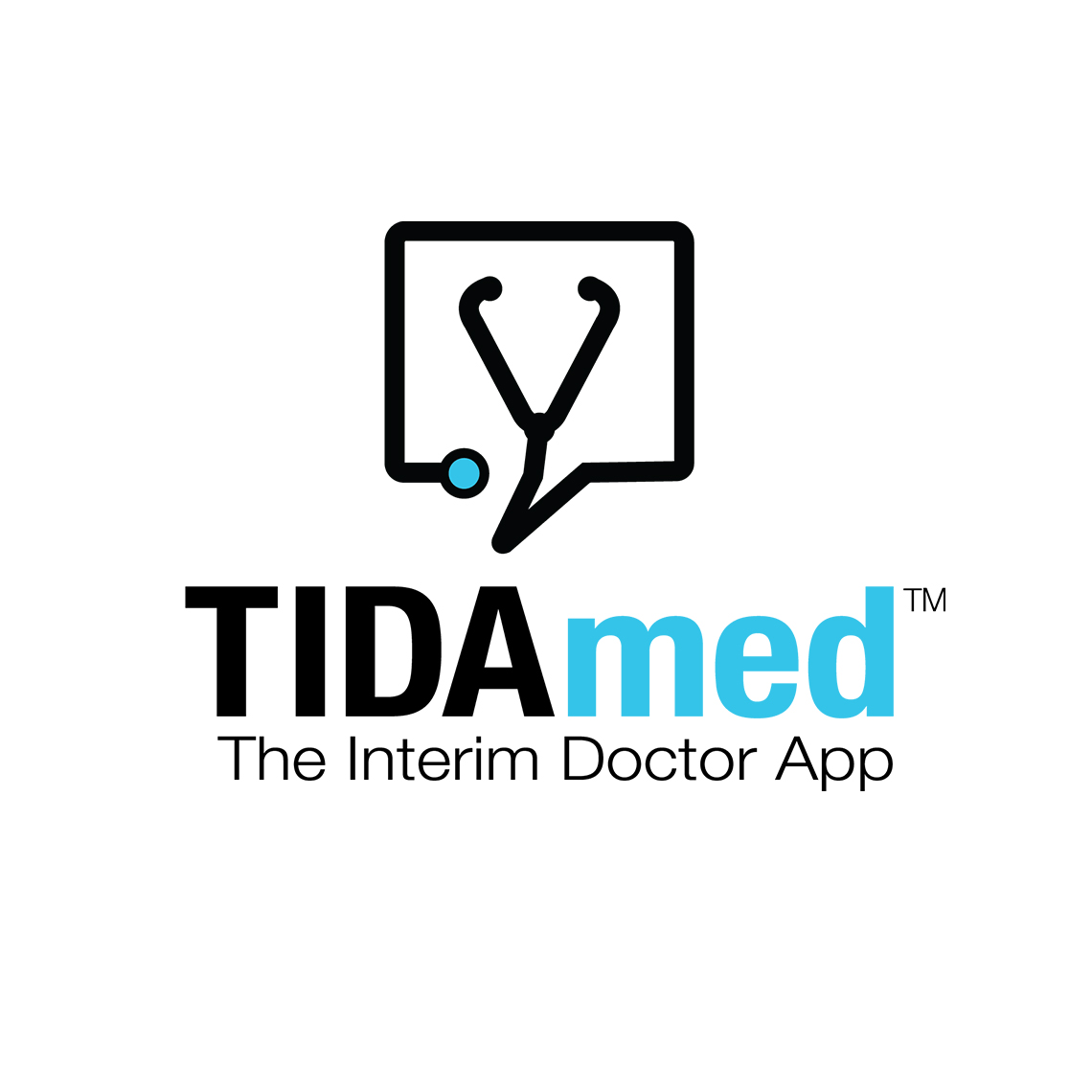
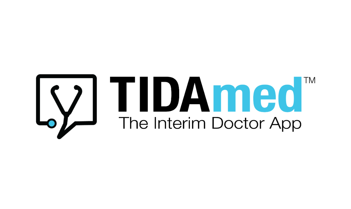
My first act as logo designer was to change their main color from red to a light blue. The CEO chose red because he thought it represented medical treatment much like many common emergency medical symbols. What he didn’t realize was that the color red is very stimulating, and invokes feelings urgency and caution. This makes sense on an ambulance or first aid building but for a new medical app we want to create a sense of security and trust. Therefore, I decided to go with light blue which also commonly represents the medical field, and creates a calming feeling.
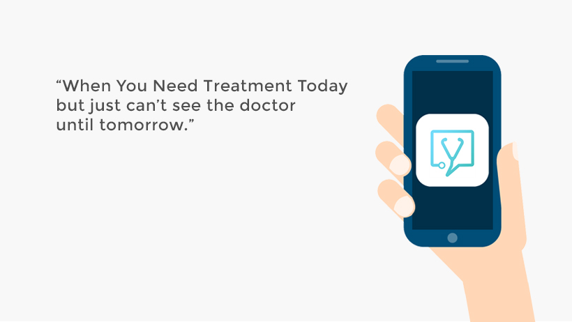
For the actual logo design I went with the traditional stethoscope shape and combined it with a messaging symbol to create a simple, yet impactful design. To jazz up the icon I added a gradient to the logo to make it on par with the designs of leading med-check apps.